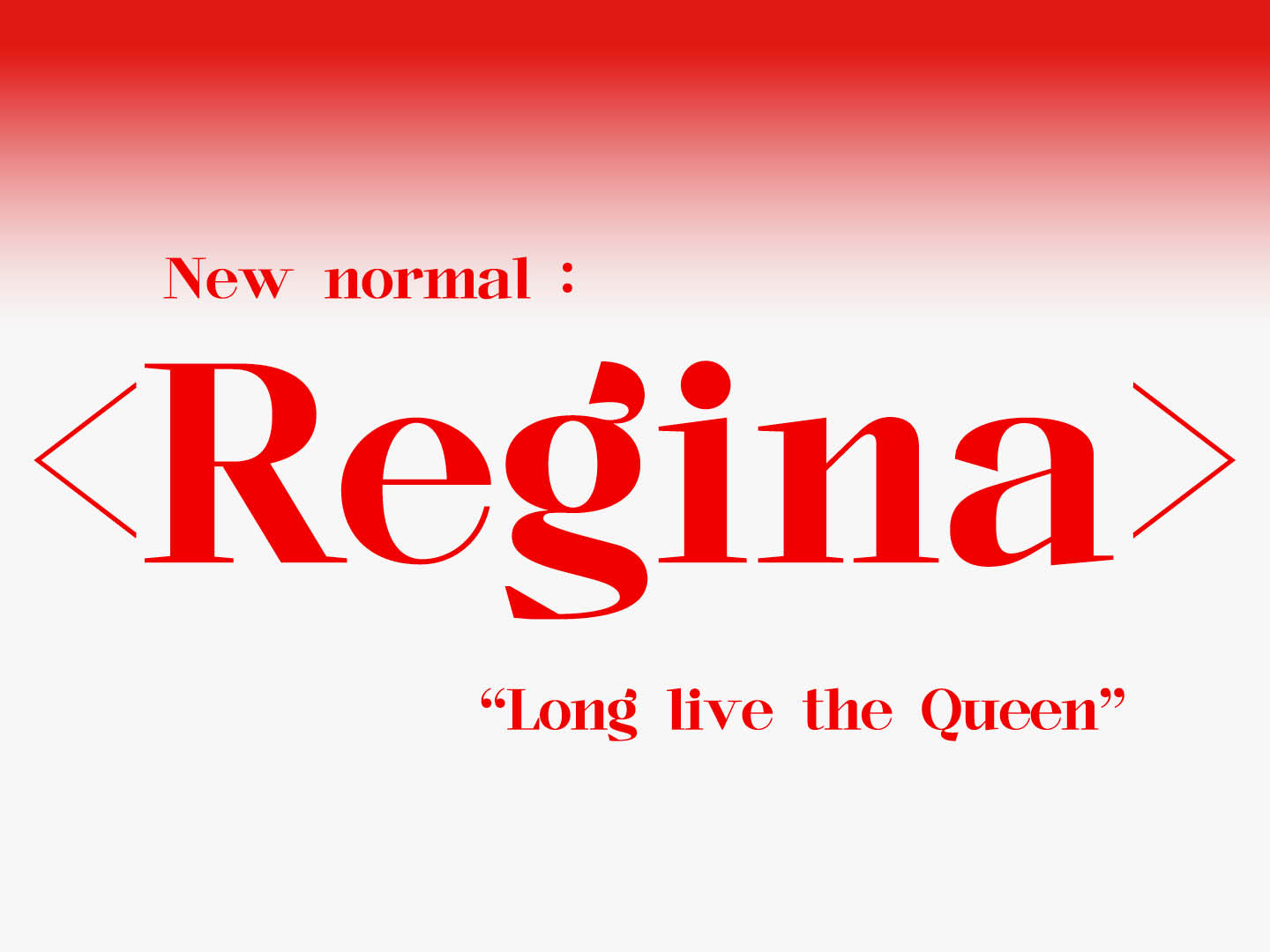
Regina
2020
Typography
Typography
Personal Project
K-TOWN TYPE CLASS
K-TOWN TYPE CLASS
︎︎︎ K-TOWN TYPE CLASS
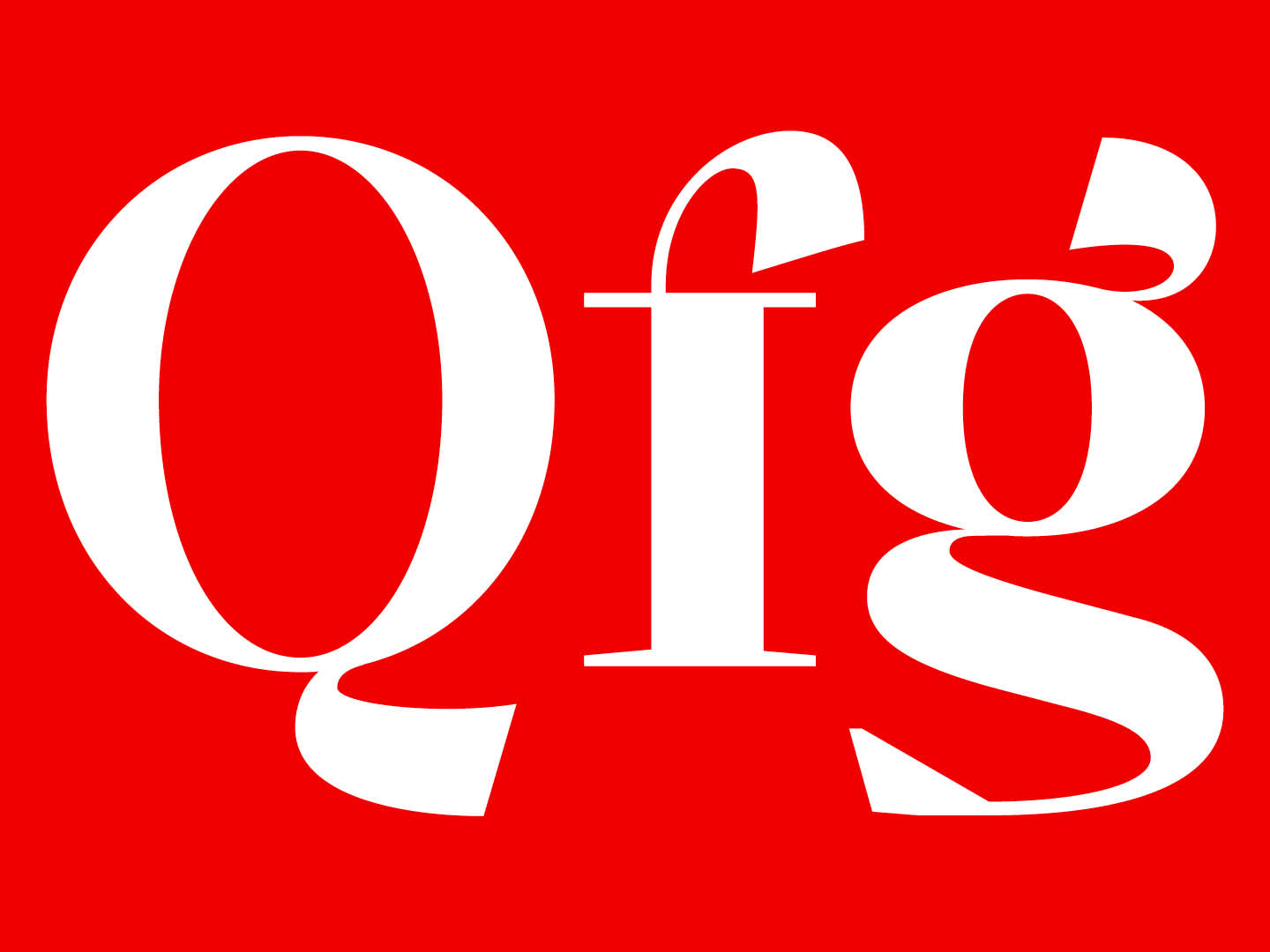
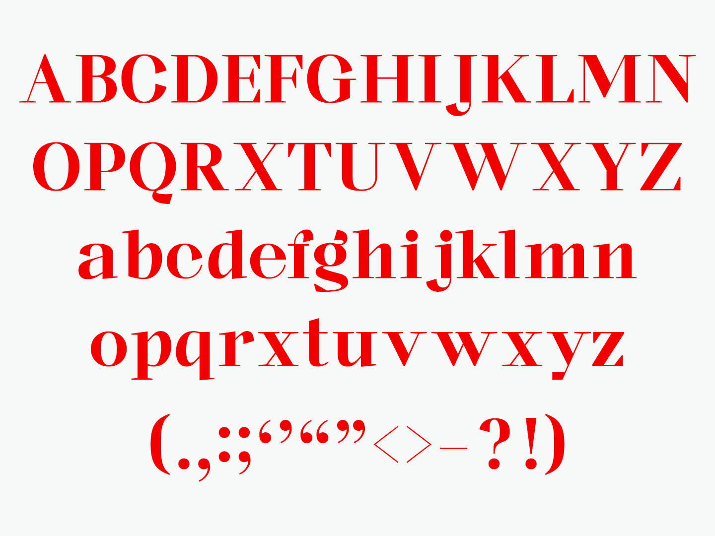
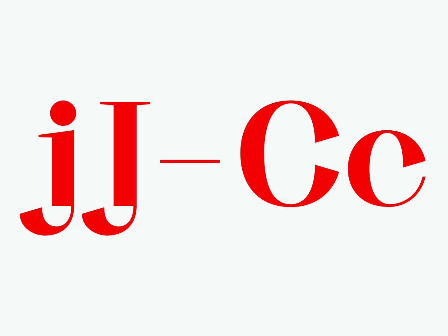
< Regina >는 붉은 여왕의 서체이다. 붉은 여왕은 권력을 유지하기 위해 열정적이다. 전통성을 지키며 새로움을 모색한다. 가로세로 획의 대비가 강하며 탄력적인 세리프는 휘날리는 깃발을 상징한다. 붉은 여왕처럼 존재가 강하고 뚜렷한 제목용 서체이다.
“제자리에 있고 싶으면 죽어라 뛰어야 한다”
《거울 나라의 앨리스》, 붉은 여왕
“제자리에 있고 싶으면 죽어라 뛰어야 한다”
《거울 나라의 앨리스》, 붉은 여왕
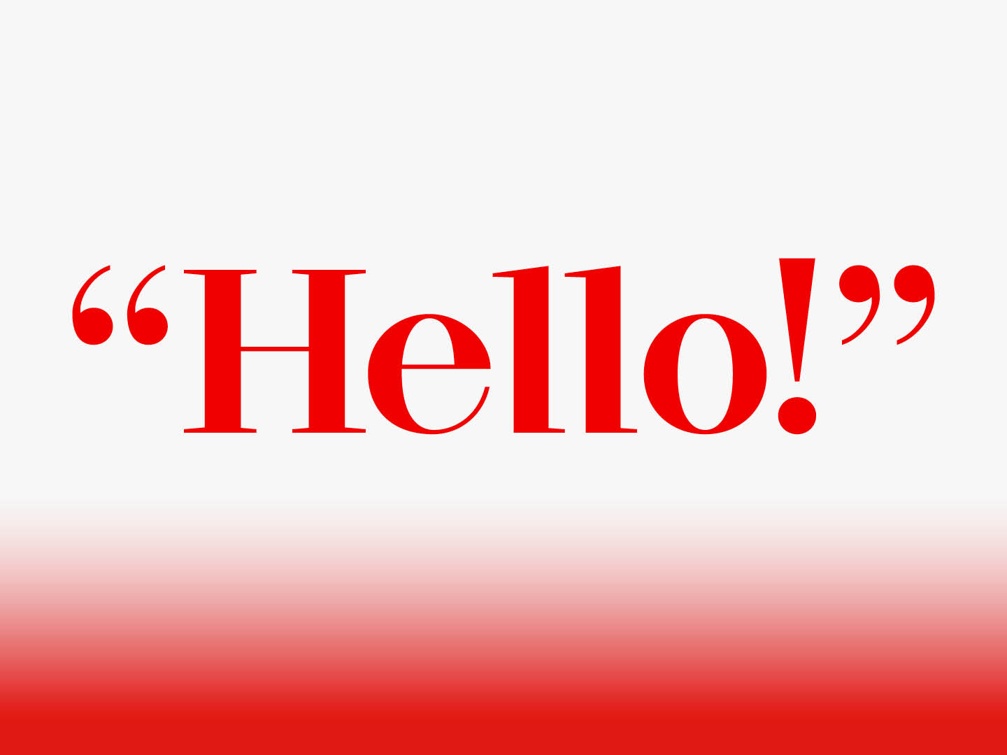
<Regina> is the typeface of the Red Queen. The Red Queen is passionate to stay in power. Seeking newness while keeping traditionality. The contrast of the horizontal and vertical strokes is strong and the elastic serif symbolizes the flapping flag. Like the Red Queen, it is a strong and distinct title font.
“Now, here, you see, it takes all the running you can do, to keep in the same place.”
《Through the Looking-Glass and What Alice Found There》, Red Queen
“Now, here, you see, it takes all the running you can do, to keep in the same place.”
《Through the Looking-Glass and What Alice Found There》, Red Queen