TAMTAM
2020
Brand Identity
Brand Identity
Personal Project
Ewha.W.Univ.
Ewha.W.Univ.
<TAMTAM>은 한국에서 Post Corona 시대를 맞이하는 2030 1인 탐험가를 위한 여행 브랜드다. 로고는 '探(찾을 탐)'을 두번 반복하여 '찾음을 찾는다'라는 의미를 내포하고 있다. 한국탐험가로서 "새로운 일상을 발견하고 풍류를 즐길 것"이란 사명감을 가지게 한다. 여기서 화살표는 찾는 과정을 나타낸다.
대동여지도의 시각요소들을 분해하고 재해석하여 <TAMTAM>을 디자인하였다. 이를 통해 대동여지도로 여행하던 선비와같이, 구독자들도 자연을 즐길 수 있다.
지도와 A의 모양에서 화살표 컨셉을 가져왔다. 한국은 근현대에 와서 화살표 기호를 받아들였기 때문에 화살표와 대동여지도는 이질적 조합이다. 이를 통해서 현대적 방향성을 얻고자 했다.
대동여지도의 시각요소들을 분해하고 재해석하여 <TAMTAM>을 디자인하였다. 이를 통해 대동여지도로 여행하던 선비와같이, 구독자들도 자연을 즐길 수 있다.
지도와 A의 모양에서 화살표 컨셉을 가져왔다. 한국은 근현대에 와서 화살표 기호를 받아들였기 때문에 화살표와 대동여지도는 이질적 조합이다. 이를 통해서 현대적 방향성을 얻고자 했다.
<TAMTAM> is a brand that publishes guidebooks and suggests a lifestyle for explorers in their twenties and thirties. It is tailored to serve Koreans traveling alone in the post-COVID era. The brand name is a two-time repetition of Chinese character '探(TAM, meaning search)' and signifies ‘in search of a journey finding oneself’. As a Korean explorer, we have the mission of "discovering a new lifestyle and finding respite in nature." At this point, the arrow indicates the search process.
The visual elements from the Daedongyeojido map (1861, Joseon Dynasty) were decomposed and reinterpreted to <TAMTAM> Brand Identity. Like the literati who traveled with the Daedongyeojido, the subscribers can enjoy nature through <TAMTAM>.
A double-sided arrow replaces the two A’s on the <TAMTAM> logo. The arrow motif is borrowed from maps. However, an arrow and the Daedongyeojido are a disparate combination, because it was not until the modern times that Korea adopted the arrow sign from the Western culture. Through this, I sought to gain modern orientation.
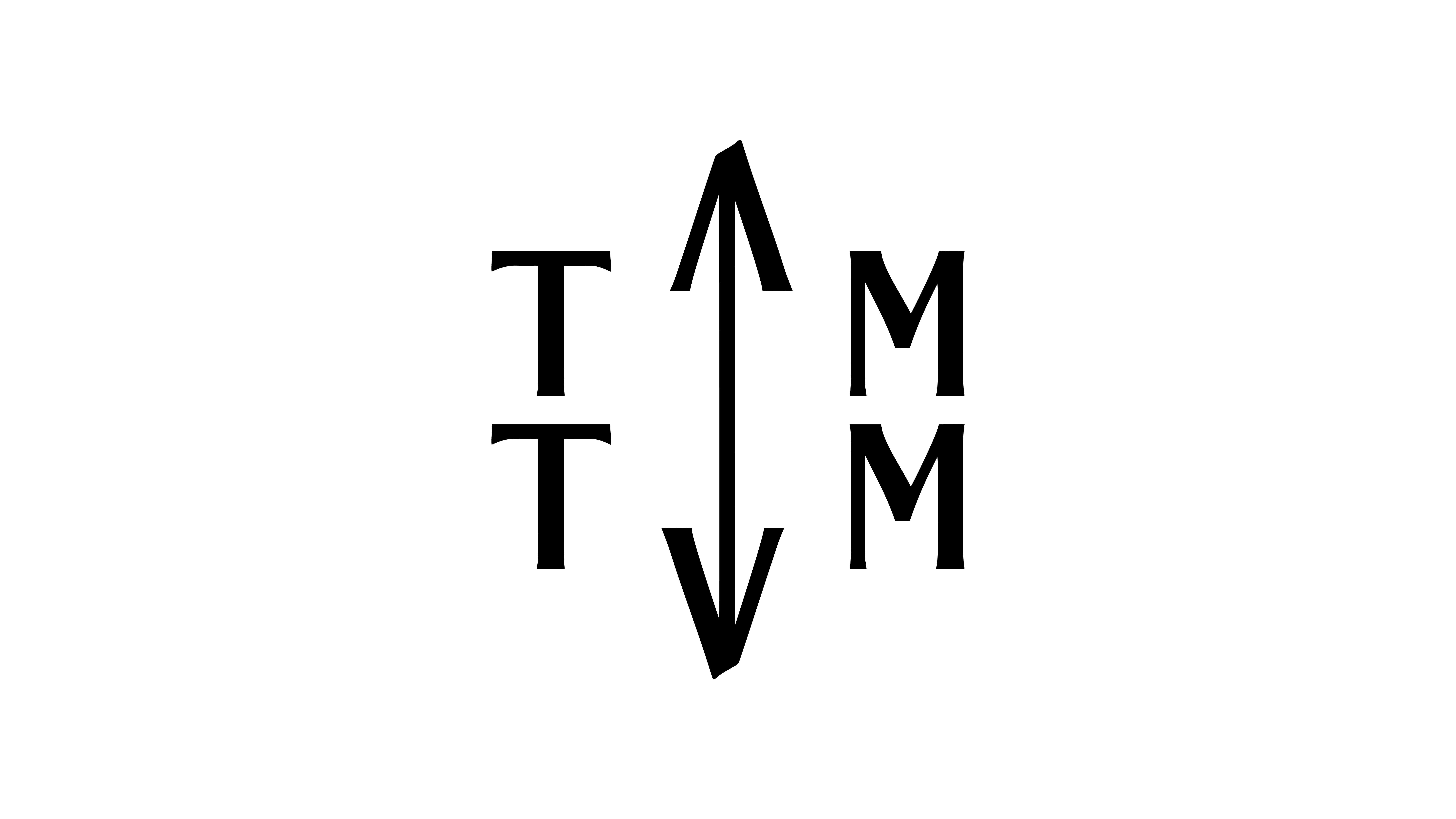
Logo
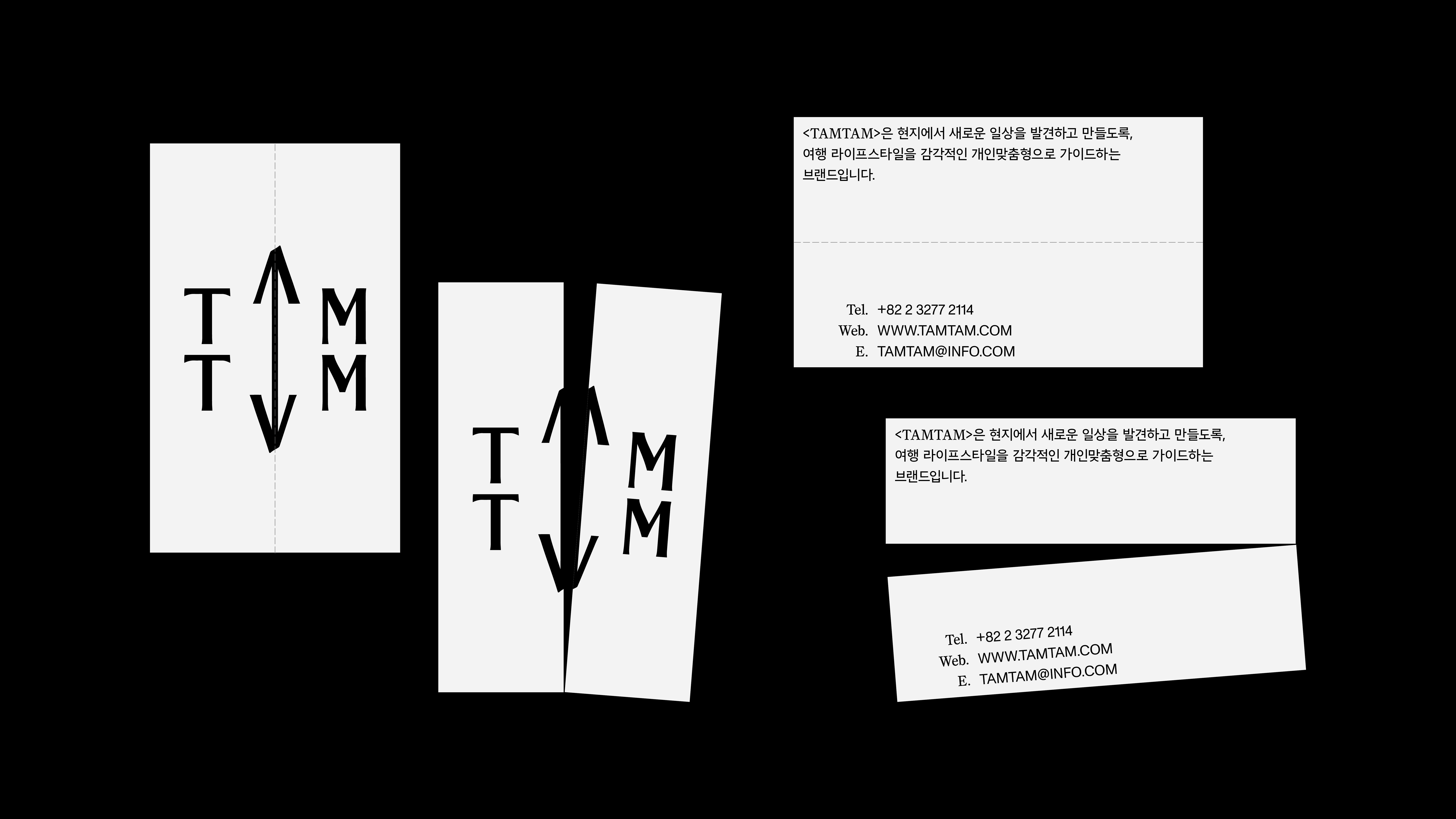
![]() Business Card
Business Card
![]() Post Card
Post Card
![]()
Map
![]()
Goods
 Business Card
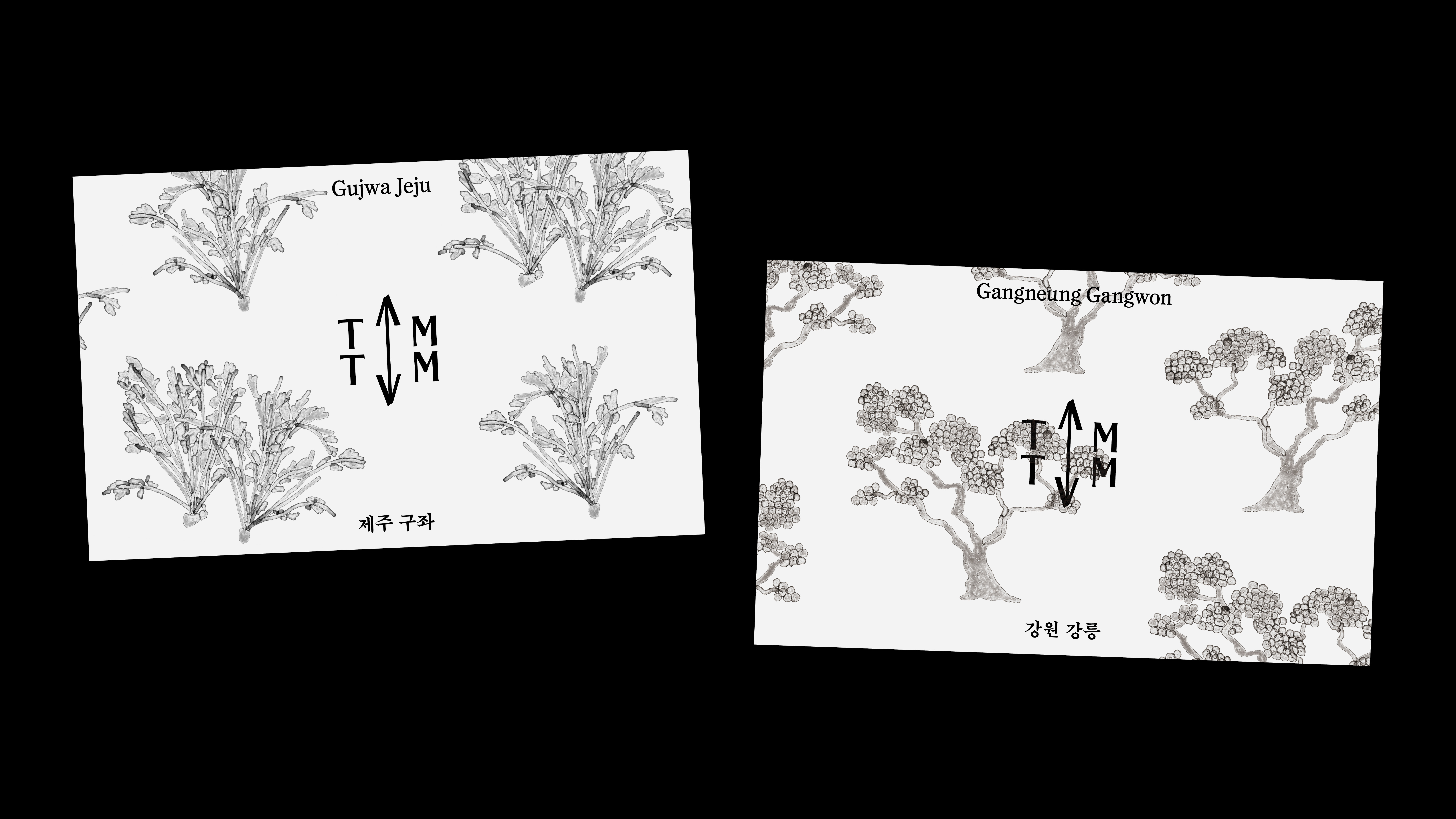 Post Card
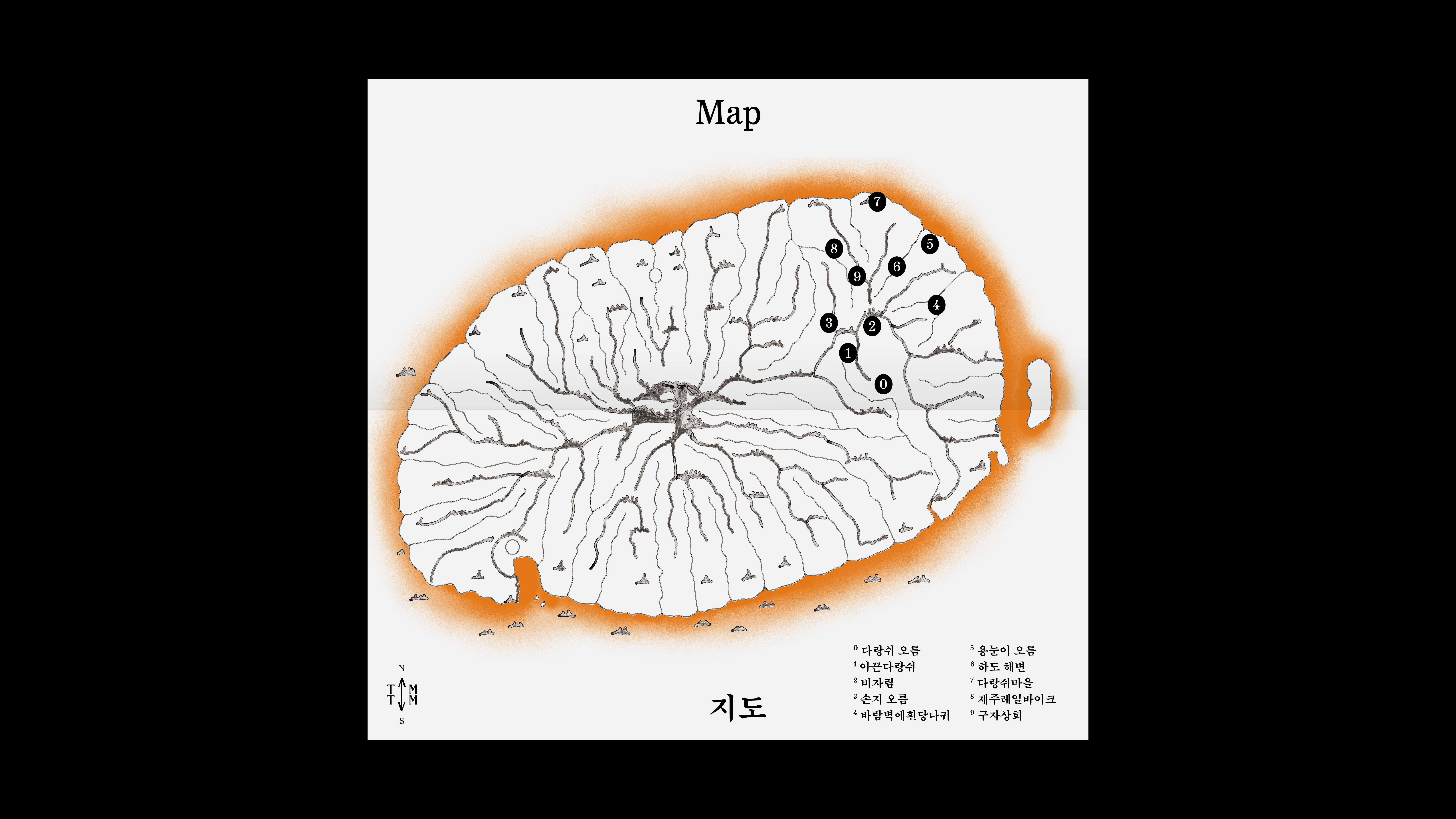
Map
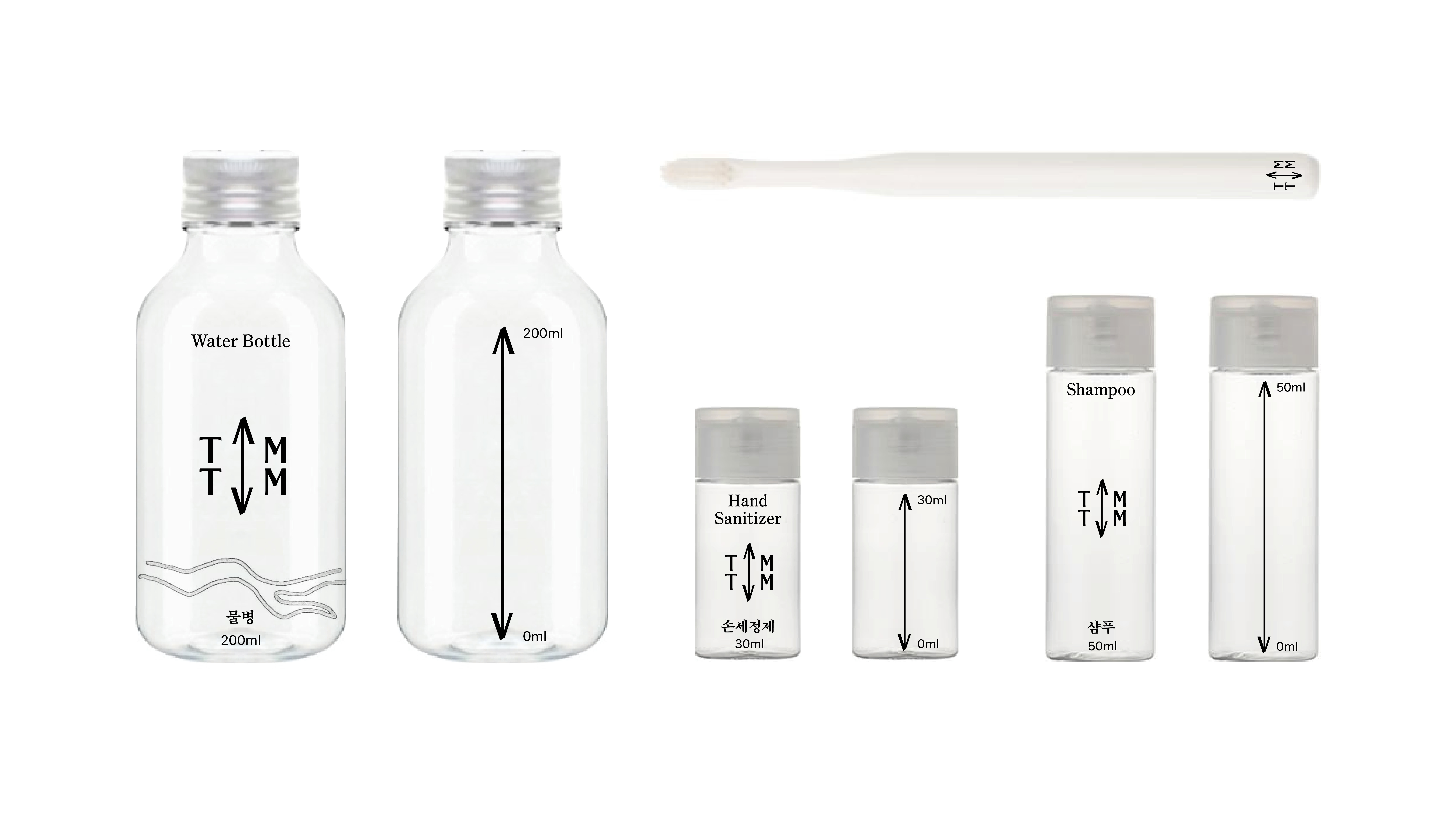
Goods